CSS Box Model | Box-sizing


Back with another topic which is very common now a days with CSS developer's and is very useful. As we all know everything in web has a box around it, yes you guessed it right today I'm going to talk about the CSS Box Model.
The Box Model is one of the basic things in CSS, Understanding the boxes is the key to being able to create your own layouts with CSS Box Model, with this it will be very easy to align items with other items. Box Model is going to be used throughout your web development journey, even if you're using any other frameworks like React.js, Angular etc.
So in this article, I will be sharing the purpose of using the Box Model and later will understand the types of box model.
# Box Model
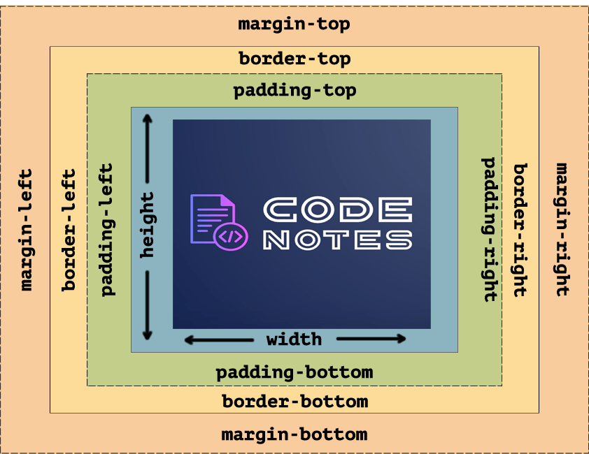
The above image determines the Size, Position, Properties (Color, Background, Border-size, margin, Padding and the Content itself ). First I'll explain the above image of box model is used to describe an element's dimensions and structure.
Content: This area consists of content like text, image, or other media content. It is bounded by the content edge and its dimensions are given by content box width and height. The height and width properties are used to set the height and width of an element.
Padding: Outside of the content element is the padding element with its dimension which goes from top to bottom right to left in this you can add padding like
padding: 10px 15px;( x/y ). Or by using every single side of padding to- top right bottom left.
padding: 5px 8px 5px 8px;Border: By default border is set to 0.The border is the line surrounding the content and the padding, and separating them from the margin.
Margin: The space between the element considered from the outer edge of the borderand its surrounding elements.
Adding the source code below:
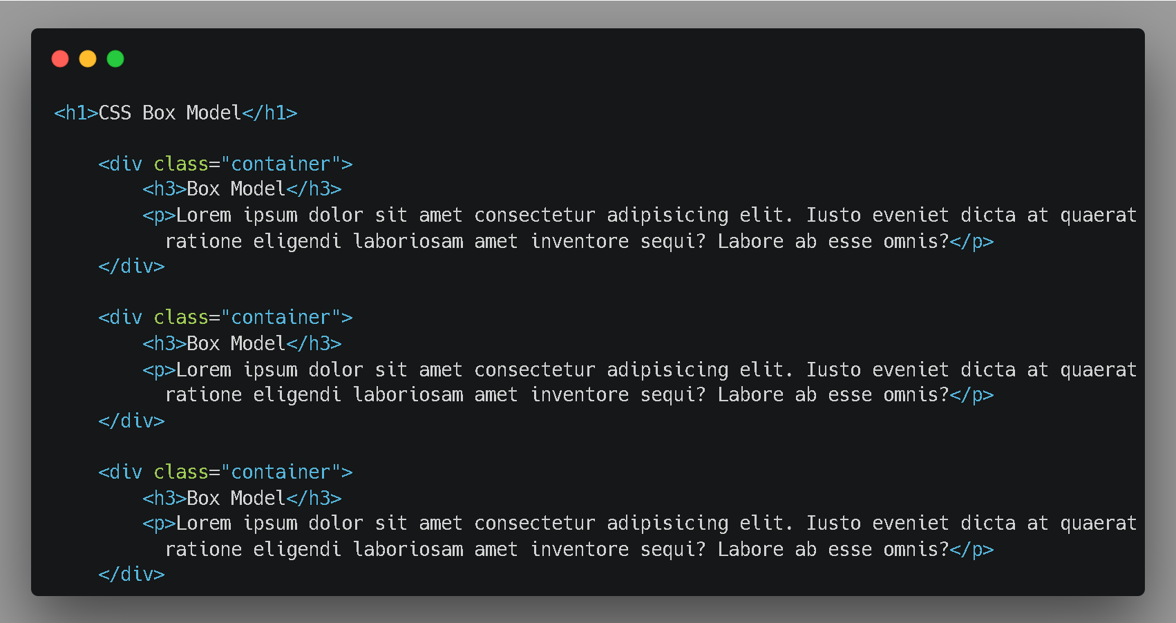
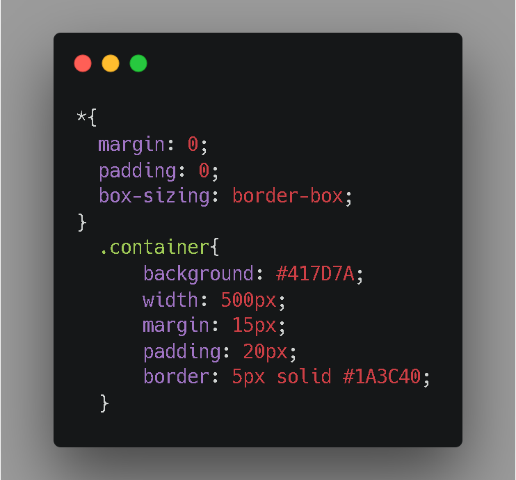
Here is the CSS
Types of Box-sizing
Giving a quick review of how content-box work, So here in this code I have adjust the box-sizing to content box (it is a by default by the browser )
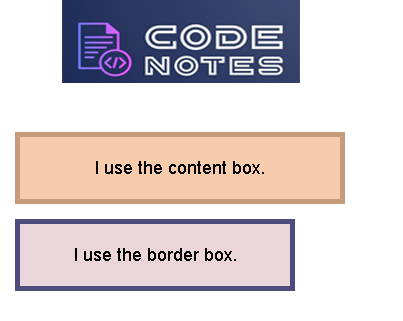
<div class="content-box">
        <p>I use the content box.</p>
    </div>
- Content-box : It is the default CSS box model, only the content of the box is taken in effect when calculating the width of the box.
Note: the dimensions of the element are calculated as: width = width of the content, and height = height of the content. (Borders and padding are not included in the calculation.)
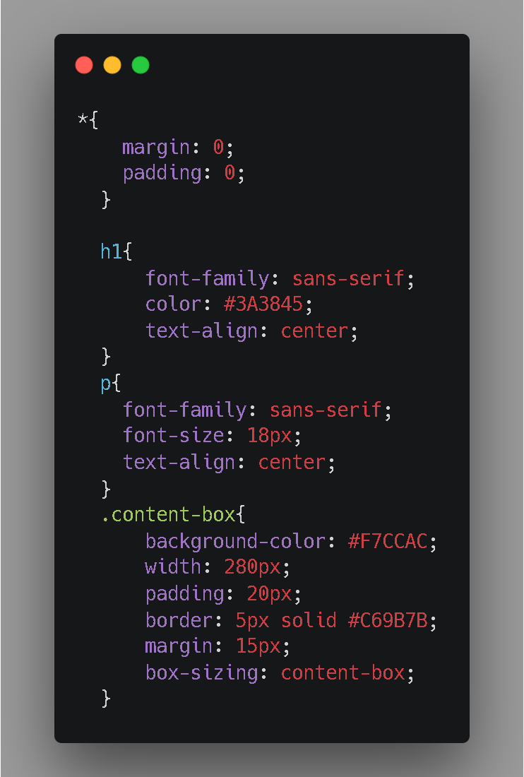
Logic behind this: The Dimension of the content-box is calculated as:
/*  Total width: 280px + (2 * 20px) + (2 * 5px) = 330px
     Total height: 80px + (2 * 20px) + (2 * 5px) = 130px
     Content box width: 280px
     Content box height: 80px
*/
- Border-box: In this padding and border will be inside the box. It is much easier to work with border-box.
<div class="border-box">
        <p>I use the border box.</p>
    </div>
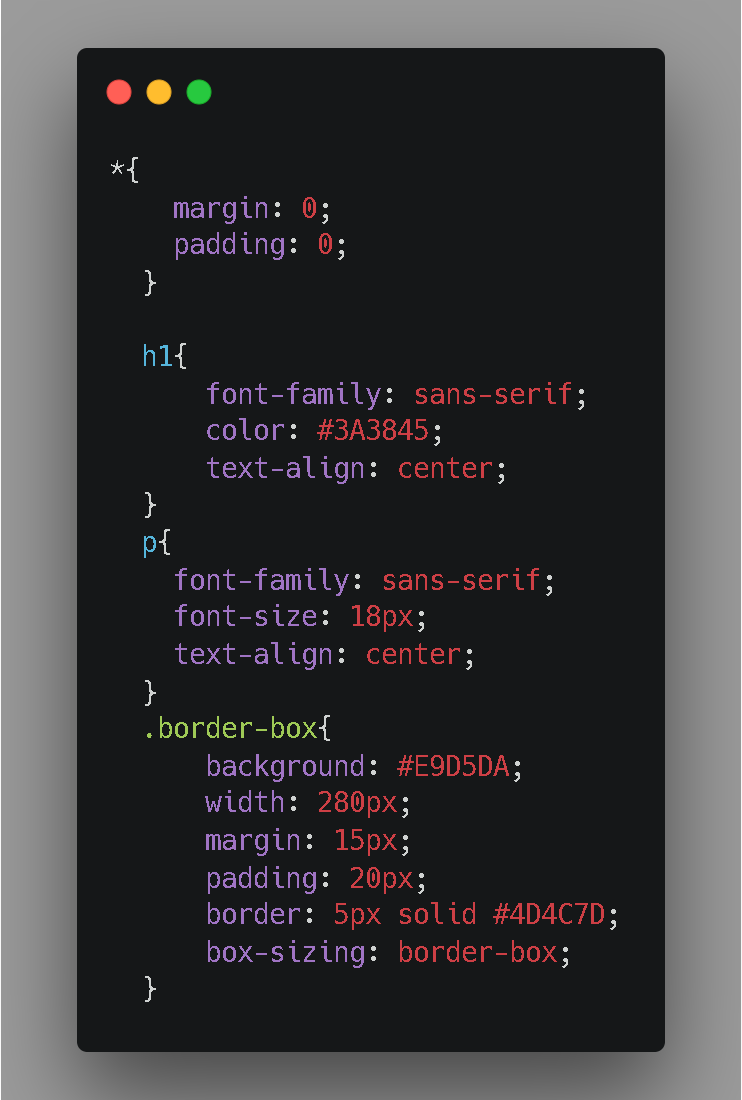
Note: Here the dimensions of the element are calculated as: width = padding + border + width of the content, and height = border + padding + height of the content.
     Total width: 280px
     Content box width: 280px - (2 * 20px) - (2 * 5px) = 230px
Output is